John Blanche didn’t like using blue. He reckoned the pigment faded badly over the years, so the man who designed the look of an entire fictional galaxy mostly worked in browns, ochres, rust, bone, and that specific sickly green you can still find on the spine of an old codex. Look at enough of his stuff and the palette gives him away before the signature does. Browns and rust and that green, over and over.
He died in early June, at 77. The news went round on a Tuesday, announced on behalf of his wife Lin, and within about a day every hobby site, every subreddit, every Discord I’m in had the same two or three pieces of his art posted at the top. Most of them I’d seen a hundred times without ever clocking the signature.
That’s the thing about Blanche. He’s not a famous illustrator the way a famous illustrator usually is, where you know the name first and seek out the work. It went the other way round. You knew the work for fifteen years, it was just what 40K looked like, and only later did you find out one bloke was responsible for most of the foundation.
John Blanche didn’t draw the setting, he was the setting
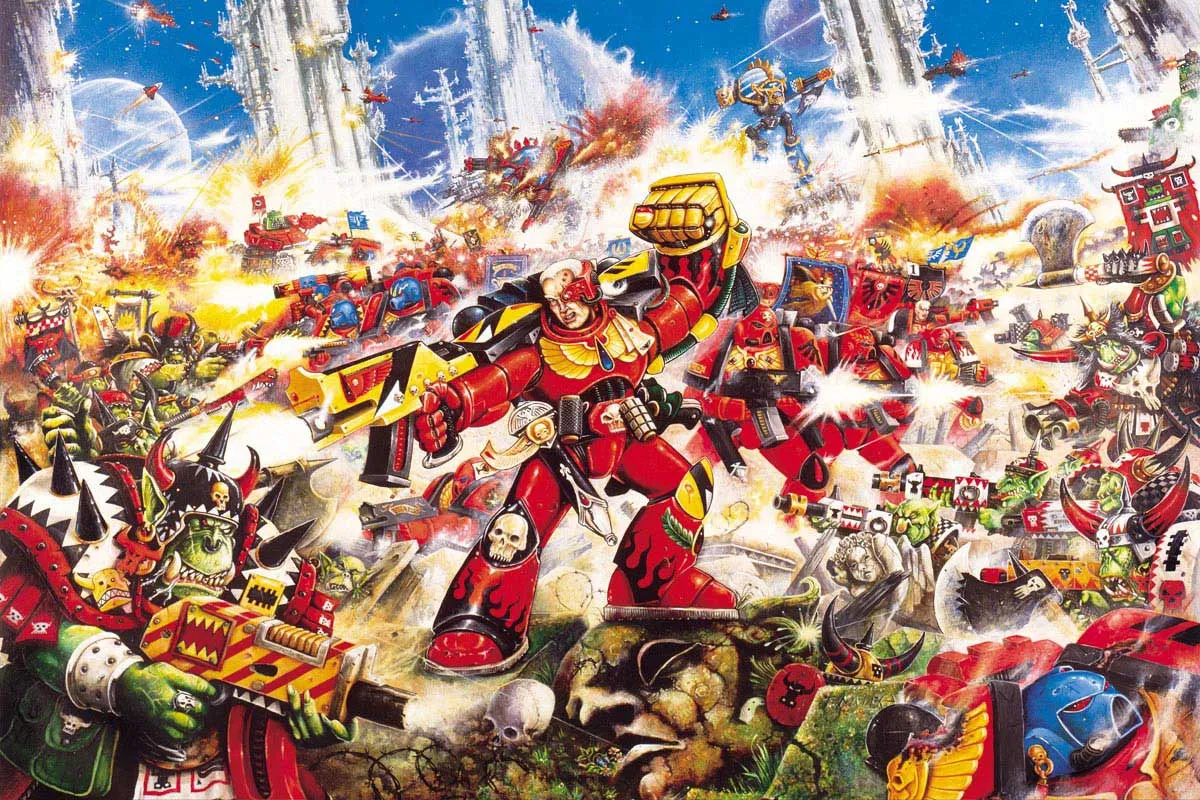
Quick history, because it matters for what came after. Blanche joined Games Workshop in 1977, doing the cover for the fourth ever issue of White Dwarf. He did the box art for the first edition of Warhammer Fantasy Battle in 1983. When the company moved to Nottingham in 1986 he became art director, and the year after that he was art directing and painting for the original Rogue Trader rulebook. So 40K has his actual paint on its actual first rulebook, page one onwards.
It wasn’t just the one painting either. When second edition landed in 1993 he turned out a huge amount of interior work fast, plus the cover of that boxed set, the Blood Angels piling into a mob of Orks. The Eternity Gate. Loads of the little vignettes scattered through the rulebook that you absorbed without ever reading a caption. If you owned 40K in the nineties you owned a small Blanche gallery and didn’t know it.
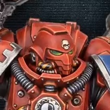
The famous one is the Emperor sat on the Golden Throne. He painted it for Rogue Trader and it’s probably been reprinted more than any other single piece of 40K art. We did a whole thing a while back on how that painting was never actually meant to be the literal Emperor, it’s the symbolic version pilgrims imagine when they arrive on Terra, which is a much better story than “old man on a chair” and I won’t redo it here. Go read that one if you want the deep dive on the Emperor himself.
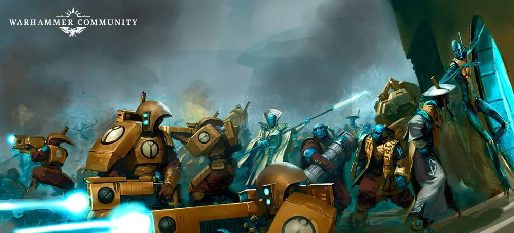
The look is the real legacy, though. And it took me embarrassingly long to work out why: the grimdark aesthetic is basically a description of Blanche’s brushwork that the lore caught up to. The pictures came first and the writing followed them.
Think about it. The Imperium is described as decaying, gothic, encrusted with skulls and parchment and gold leaf going green, everything too ornate and too old and slightly rotten. That’s how Blanche paints. He works in a frantic, scratchy, overloaded style with religious junk crammed into every corner, and the writers and sculptors looked at it and went, right, that’s the universe now. Thirty-odd years of novels and miniatures then backfilled the lore to match the pictures.
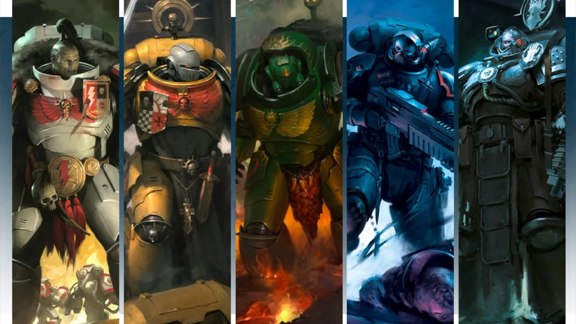
He called it baroque himself, which is a more accurate word for it if you’ve ever stood in front of a proper Counter-Reformation altarpiece and felt slightly sick from how much gold and agony is happening at once. His influences were Dürer, Rembrandt, the pre-Raphaelites, punk fashion, and military illustration, all jammed together. You can see all of it if you look. The punk especially, in the way his figures are studded and chained and deliberately ugly.
Blanchitsu, or how he changed the way I paint badly
In the 2000s Blanche got involved with a loose collective called Inq28. The idea was small narrative warbands, mostly Inquisitor-scale conversions, built and painted for the story rather than the table. White Dwarf ran a column on it called Blanchitsu, named after him, showing off these grotty kitbashed gangs.
And that column did something I don’t think GW fully intended. It quietly told a generation of hobbyists that you didn’t have to paint like the ‘Eavy Metal team. You didn’t need clean edge highlights and a wet palette and twelve thin coats. You could work limited, muddy, restrained. Loads of wash, dirty drybrush, a palette of about four colours, and the model would often come out looking grimier and more restrained and frankly better than the box art ever managed.
I tried this. Around 2016 I decided I was going to do a little Inquisitorial warband in the Blanchitsu style, full of converted bits from my Imperial Fists sprues and whatever was in the bits box. Restrained palette, loads of Agrax, the whole thing. It looked like mud. Not atmospheric mud, not evocative-decay mud. Actual mud, like I’d dropped the models in a puddle. Turns out “limited palette and lots of wash” is incredibly hard to do well, and what looks loose and effortless in Blanche’s hands is the result of fifty years of knowing exactly which corners to cut. Pete took one look at my Inquisitor and asked if it was meant to be on fire. It was not meant to be on fire.
Some of this goes back further than the column. There was a whole game called Inquisitor in the late nineties, 54mm scale, basically a roleplay-skirmish thing built for exactly this kind of narrative warband, and Blanche was right in the middle of that scene before it became a White Dwarf fixture. Even after he retired from GW in 2023 he kept at it, did character designs for a little 54mm duelling game and a book of pen-and-ink work. The man drew until the end.
But that’s the influence right there. The fact that a guy in his living room in 2016 was even attempting a muddy limited-palette warband instead of trying to copy the box art, that’s downstream of Blanchitsu. He’s the reason “weird and narrative and ugly on purpose” counts as a real way to do the hobby and not just doing it wrong. The whole indie scene that came after, 28 Magazine, Turnip28, Trench Crusade, all of it traces back through that column to him.
So yeah. Blanche. Old bloke, didn’t use blue, drew the Emperor once and accidentally defined a billion-dollar setting. Painted in a style nobody could quite copy. Retired in 2023 after, what, forty-six years at the company? That’s longer than I’ve been alive by a decent margin, and I’m not young. Point is he was there the entire time, from White Dwarf 4 to basically the present.
The look is already changing, and that’s the part worth sitting with
I’ll waver a bit here, because I’m genuinely not sure how I feel about it. The 40K of right now doesn’t really look like Blanche anymore. Go look at the new edition trailer, all that crisp cinematic CG, gorgeous lighting, clean rendered armour. It’s stunning. It’s also basically the opposite of a scratchy ochre Blanche painting. Modern GW art is digital, polished, high-contrast, the kind of thing you can read from across a shop floor.
And part of me thinks that’s fine, that’s just what happens, every visual style gets sanded smooth by commercial reality eventually and you can’t keep an entire IP looking like a 1991 White Dwarf forever. The new stuff sells, the new stuff looks incredible on a phone screen, and a kid getting into the hobby this year through the trailer is having exactly the same “whoa” moment I had through a battered second-edition box.
But then I pull an old codex off the shelf, one of the proper ugly ones, and the Blanche bits hit completely different. There’s a texture to them. A hand-made, slightly-deranged quality that no render has. The skulls look like someone enjoyed painting them a bit too much. The gold is dirty. You can feel a person behind it, having opinions, refusing to use blue. I dug out my second-edition rulebook to write this and ended up just sitting with it for half an hour, turning pages, which I had not planned to do on a work night. I don’t get that off the clean stuff, however pretty it is.
I don’t have a neat resolution for that. He’s gone, the style that started with him has mostly moved on, and both of those things are true at once and a bit sad and also completely normal. If you want to actually understand why the Imperium looks the way it looks, though, you’ve already met the answer, you just maybe didn’t know his name until this week. Pull the oldest, grottiest 40K book you own off the shelf and actually look at the interior art for a bit. The signature’s probably his.